Images and Text
BC20 - Images & Text

Code With ACF Integration
HTML
<!-- BC20 Start ------------------------------->
<?php if ( have_rows( 'bc20' ) ) : ?>
	<?php while ( have_rows( 'bc20' ) ) : the_row();?>
<section id="bc20">
	<div class="container">
		<div class="row">
			<div class="col-12 col-lg-6">
				<h2><?php echo get_sub_field('header'); ?></h2>
				<h3><?php echo get_sub_field('sub_header'); ?></h3>
				<?php echo get_sub_field('text'); ?>
			</div>
			<div class="col-12 col-lg-6">
				<div class="row">
					<div class="col-12" align="center"><img src="<?php echo get_sub_field('main_image'); ?>" ></div>
					<div class="col-6 mt-4" align="left"><img src="<?php echo get_sub_field('sup_image1'); ?>" ></div>
					<div class="col-6 mt-4" align="right"><img src="<?php echo get_sub_field('sup_image_2'); ?>" ></div>
				</div>


			</div>
		</div>
	</div>
</section>
	<?php endwhile; ?>
<?php endif; ?>
<!-- BC20 END ------------------------------->
CSS
/*-- BC20 START --------------------------------------*/
#bc20{
	margin-top: 60px;
}
#bc20 h2{
	font-size: 4em;
	margin-bottom: 0;
}
#bc20 h3{
	font-size: 1.5em;
    font-style: italic;
}
#bc20 p{
    font-size: 0.98em;
    color: #545454;
}
#bc20 img{
	border-radius: 5px;
}
/*-- BC20 END --------------------------------------*/
Images can change in size. This is a rough idea:
Top image: 590px X 390px
Bottom 2 images: 290px X 345px
A0032
Code With ACF Integration
HTML
<!-- A0032 ------------------------------------------------>
<?php if (have_rows('a0032')) : ?>
    <?php while (have_rows('a0032')) : the_row(); ?>
        <section id="a0032">
            <div class="a0032-item">
                <div class="a0032-item-video">
                    <h5><?php echo get_sub_field('video1_title'); ?></h5>
                    <video width="100%" height="auto" src="<?php echo get_sub_field('video_1_url'); ?>" preload
                           controls></video>
                    <h5><?php echo get_sub_field('video1_title'); ?></h5>
                    <video width="100%" height="auto" src="<?php echo get_sub_field('video_2_url'); ?>" preload
                           controls></video>
                </div>
            </div>
            <div class="a0032-item">
                <h2><?php echo get_sub_field('header'); ?></h2>
                <h3 style="padding-bottom: 8px;"><?php echo get_sub_field('subtext1'); ?></h3>
                <h3><?php echo get_sub_field('subtext2'); ?></h3>
                <h3><?php echo get_sub_field('subtext3'); ?></h3>
                <ul>
                    <?php while (have_rows('items')) : the_row(); ?>
                        <li><?php echo get_sub_field('item_text'); ?></li>
                    <?php endwhile; ?>
                </ul>
            </div>
            <div class="a0032-item a0032-item-last">
                <img src="<?php echo get_sub_field('right_image'); ?>">
            </div>
        </section>
    <?php endwhile; ?>
<?php endif; ?>
<!-- A0032 END ------------------------------------------------>
CSS
/* a0032 css ----------------------------------------------------------- */

#a0032 {
    display: grid;
    grid-template-columns: 1fr 400px 1fr;
    align-items: center;
    justify-items: normal;
    width: 100%;
    margin: auto;
    position: relative;
    border-bottom: 15px solid #BCBEC0;
}

#a0032 video {
    max-width: 350px;
    border: 2px solid;
    border-radius: 5px;
}

.a0032-item {
}

.a0032-item img {
    width: auto;
    float: right;
    max-height: 550px;
    min-height: 500px;
}

.a0032-item h2 {
    line-height: 1em;
    margin: 0px;
    font-size: 4em;
    color: #F1748A;
    font-family: 'NexaRegular';
    font-weight: 600;
    text-align: center;
    margin-bottom: 10px;
}

.a0032-item h3 {
    font-size: 36px;
    font-family: 'NexaRegular';
    color: #19BED5;
    text-align: center;
    font-weight: 700;
    margin-bottom: 3px;
    line-height: 35px;
}

.a0032-item h5 {
    font-size: 20px;
    font-family: 'NexaRegular';
    text-align: left;
    font-weight: 700;
    color: #5c5b5b;
    margin-top: 10px;
}

.a0032-item li {
    font-size: 24px;
    font-family: 'NexaRegular';
    color: #F1748A;
    text-align: left;
    font-weight: 700;
}

.a0032-item ul, ol {
    display: block;
    margin: auto;
    max-width: 330px;
    margin-top: 25px;
    margin-bottom: 20px;
}

.a0032-item ul {
    list-style: none; /* Remove default bullets */
}

.a0032-item ul li::before {
    content: "\25A0";
    color: #19BED5;
    font-weight: bold;
    display: inline-block;
    width: 1em;
    margin-left: -1em;
}

.a0032-item-video {
    width: fit-content;
    margin: auto;
}

@media (max-width: 1200px) {
    .a0032-item-last {
        display: none;
    }

    #a0032 {
        margin-top: 20px;
        display: grid;
        grid-template-columns: 1fr 1fr;
        align-items: center;
        justify-items: normal;
        grid-gap: 20px;
    }
}

@media (min-width: 1901px) {
    #a0032 {
        margin-top: 260px;
    }
}

@media (max-width: 1900px) {
    #a0032 {
        margin-top: 245px;
    }
}

@media (max-width: 1650px) {
    #a0032 {
        margin-top: 190px;
    }
}

@media (max-width: 1448px) {
    #a0032 {
        margin-top: 165px;
    }
}

@media (max-width: 1200px) {
    #a0032 {
        margin-top: 160px;
    }
}

@media (max-width: 992px) {
    #a0032 {
        margin-top: 20px;
    }
}

@media (max-width: 768px) {

    #a0032 {
        grid-template-columns: 1fr;
    }

    .a0032-item {
        padding: 0px 20px;
    }

    .a0032-item h3 {
        font-size: 26px;
    }
}

/* a0032 css end ------------------------------------------------------- */
Code Only (Without ACF Integration)
HTML
<!-- A0032 ------------------------------------------------>
<section id="a0032">
<div class="a0032-item">
<div class="a0032-item-video">
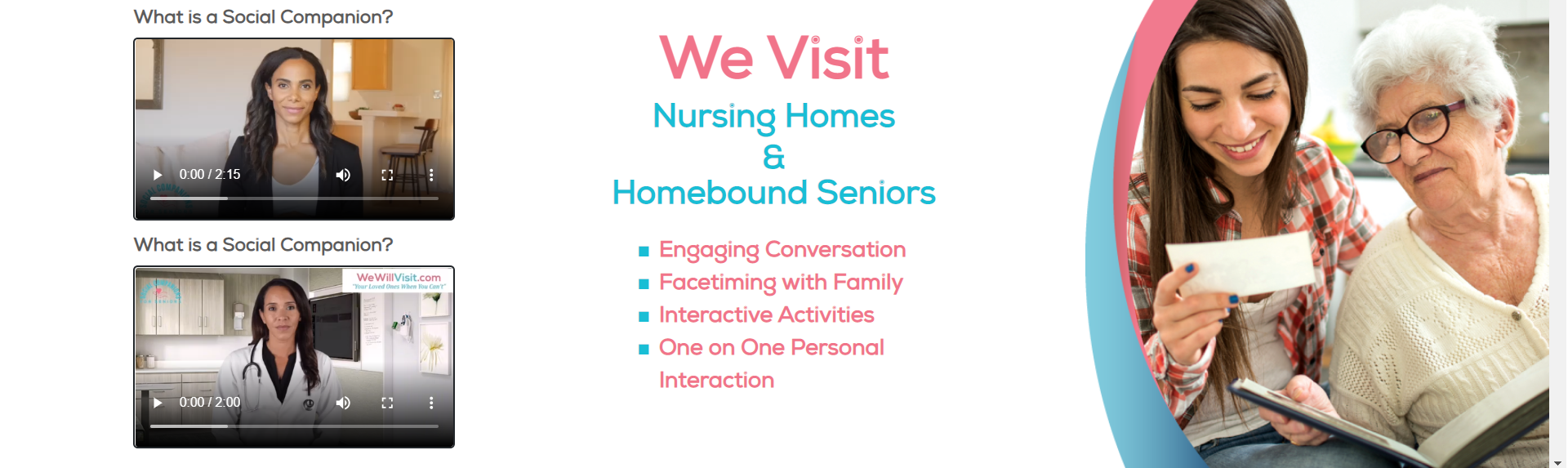
<h5>What is a Social Companion?</h5>
<video width="100%" height="auto" src="https://wewillvisit.com/wp-content/uploads/2021/06/Video.mov" preload="" controls=""></video>
<h5>What is a Social Companion?</h5>
<video width="100%" height="auto" src="https://wewillvisit.com/wp-content/uploads/2021/06/Video_1.mov" preload="" controls=""></video>
</div>
</div>
<div class="a0032-item">
<h2>We Visit</h2>
<h3 style="padding-bottom: 8px;">Nursing Homes</h3>
<h3>&</h3>
<h3>Homebound Seniors</h3>
<ul>
<li>Engaging Conversation</li>
<li>Facetiming with Family</li>
<li>Interactive Activities</li>
<li>One on One Personal Interaction</li>
</ul>
</div>
<div class="a0032-item a0032-item-last">
<img src="https://wewillvisit.com/wp-content/uploads/2021/06/img_1.png">
</div>
</section>
<!-- A0032 END ------------------------------------------------>CSS
/* a0032 css ----------------------------------------------------------- */

#a0032 {
    display: grid;
    grid-template-columns: 1fr 400px 1fr;
    align-items: center;
    justify-items: normal;
    width: 100%;
    margin: auto;
    position: relative;
    border-bottom: 15px solid #BCBEC0;
}

#a0032 video {
    max-width: 350px;
    border: 2px solid;
    border-radius: 5px;
}

.a0032-item {
}

.a0032-item img {
    width: auto;
    float: right;
    max-height: 550px;
    min-height: 500px;
}

.a0032-item h2 {
    line-height: 1em;
    margin: 0px;
    font-size: 4em;
    color: #F1748A;
    font-family: 'NexaRegular';
    font-weight: 600;
    text-align: center;
    margin-bottom: 10px;
}

.a0032-item h3 {
    font-size: 36px;
    font-family: 'NexaRegular';
    color: #19BED5;
    text-align: center;
    font-weight: 700;
    margin-bottom: 3px;
    line-height: 35px;
}

.a0032-item h5 {
    font-size: 20px;
    font-family: 'NexaRegular';
    text-align: left;
    font-weight: 700;
    color: #5c5b5b;
    margin-top: 10px;
}

.a0032-item li {
    font-size: 24px;
    font-family: 'NexaRegular';
    color: #F1748A;
    text-align: left;
    font-weight: 700;
}

.a0032-item ul, ol {
    display: block;
    margin: auto;
    max-width: 330px;
    margin-top: 25px;
    margin-bottom: 20px;
}

.a0032-item ul {
    list-style: none; /* Remove default bullets */
}

.a0032-item ul li::before {
    content: "\25A0";
    color: #19BED5;
    font-weight: bold;
    display: inline-block;
    width: 1em;
    margin-left: -1em;
}

.a0032-item-video {
    width: fit-content;
    margin: auto;
}

@media (max-width: 1200px) {
    .a0032-item-last {
        display: none;
    }

    #a0032 {
        margin-top: 20px;
        display: grid;
        grid-template-columns: 1fr 1fr;
        align-items: center;
        justify-items: normal;
        grid-gap: 20px;
    }
}

@media (min-width: 1901px) {
    #a0032 {
        margin-top: 260px;
    }
}

@media (max-width: 1900px) {
    #a0032 {
        margin-top: 245px;
    }
}

@media (max-width: 1650px) {
    #a0032 {
        margin-top: 190px;
    }
}

@media (max-width: 1448px) {
    #a0032 {
        margin-top: 165px;
    }
}

@media (max-width: 1200px) {
    #a0032 {
        margin-top: 160px;
    }
}

@media (max-width: 992px) {
    #a0032 {
        margin-top: 20px;
    }
}

@media (max-width: 768px) {

    #a0032 {
        grid-template-columns: 1fr;
    }

    .a0032-item {
        padding: 0px 20px;
    }

    .a0032-item h3 {
        font-size: 26px;
    }
}

/* a0032 css end ------------------------------------------------------- */
A0036
Code With ACF Integration
HTML
<!-- A0036 ------------------------------------>
<?php if (have_rows('a0036')) : ?>
    <?php while (have_rows('a0036')) : the_row(); ?>
        <section id="a0036">
            <div class="container">
                <div class="row">
                    <div class="col-12">
                        <div class="a0036-grid">
                            <div class="column-photos">
                                <h5><?php echo get_sub_field('header'); ?></h5>
                                <?php while (have_rows('item')) : the_row(); ?>
                                    <div class="a0036-box">
                                        <img src="<?php echo get_sub_field('image'); ?>">
                                        <h4><?php echo get_sub_field('name'); ?></h4>
                                        <h6><?php echo get_sub_field('position'); ?></h6>
                                        <a href="<?php echo get_sub_field('button_url'); ?>">
                                            <div class="a0036-btn">
                                                <img class="a0036-icon" src="<?php echo $tmp_dir; ?>Subtract.svg"><?php echo get_sub_field('button_text'); ?>
                                            </div>
                                        </a>
                                    </div>
                                <?php endwhile; ?>
                            </div>
                            <div class="column-text">
                                <?php while (have_rows('item_2')) : the_row(); ?>
                                    <h2><?php echo get_sub_field('header'); ?></h2>
                                    <ul>
                                        <?php while (have_rows('list')) : the_row(); ?>
                                            <li><?php echo get_sub_field('text'); ?></li>
                                        <?php endwhile; ?>
                                    </ul>
                                <?php endwhile; ?>
                            </div>
                        </div>
                    </div>
                </div>
            </div>
        </section>
    <?php endwhile; ?>
<?php endif; ?>
<!-- A0036 END -------------------------------->
CSS
/* A0036 -----------------------------------------------------------*/
#a0036{
    background: #9F280C;
    padding: 50px 0px;
}

#a0036 h5{
    font-family: Open Sans;
    font-style: normal;
    font-weight: 600;
    font-size: 24px;
    line-height: 33px;
    text-align: center;
    color: #FFFFFF;
    margin-bottom: 30px;
    padding-bottom: 0px;
    margin-top: 10px;
}

#a0036 h2{
    font-family: Open Sans;
    font-style: normal;
    font-weight: 600;
    font-size: 36px;
    line-height: 49px;
    text-align: left;
    color: #FFFFFF;
    margin-bottom: 20px;
}

.a0036-box{
    background: #FFEFDD;
    border-radius: 15px;
    max-width: 320px;
    display: block;
    margin: auto;
    margin-top: 18px;
    margin-bottom: 22px;
    padding-top: 15px;
    padding-bottom: 25px;
}

.a0036-grid{
    display: grid;
    grid-template-columns: 320px 1fr;
    width: fit-content;
    grid-gap: 20px;
    margin: auto;
    grid-auto-flow: dense;
}

.column-photos{
    grid-column: 1;
}

.column-text{
    grid-column: 2;
}

#a0036 ul{
    margin: 0 0 0em 0em;
}

#a0036 li{
    font-family: Open Sans;
    font-style: normal;
    font-weight: normal;
    font-size: 20px;
    line-height: 27px;
    color: #FFFFFF;
    margin-bottom: 20px;
}

.a0036-box img{
    margin: auto;
    display: block;
    padding-bottom: 10px;
}

.a0036-box h4{
    font-family: Open Sans;
    font-style: normal;
    font-weight: 600;
    font-size: 24px;
    line-height: 33px;
    text-align: center;
    color: #032E52;
}

.a0036-box h6{
    font-family: Open Sans;
    font-style: normal;
    font-weight: normal;
    font-size: 16px;
    line-height: 22px;
    text-align: center;
    color: #000000;
}

.a0036-btn{
    background: #032E52;
    border-radius: 45px;
    width: fit-content;
    margin: auto;
    padding: 10px 67px;
    font-family: Open Sans;
    font-style: normal;
    font-weight: 600;
    font-size: 16px;
    line-height: 22px;
    color: #FFFFFF;
}

.a0036-icon{
    display: unset !important;
    margin-top: 7px !important;
    margin-right: 4px !important;
}


@media (max-width: 992px) {
    .a0036-grid{
        display: grid;
        grid-template-columns: 1fr;
        width: fit-content;
        grid-gap: 0px;
        margin: auto;
        grid-auto-flow: dense;
    }

    #a0036 h2 {
        text-align: center;
    }

    .column-photos{
        grid-column: 1;
        grid-row: 2;
    }

    .column-text{
        grid-column: 1;
        grid-row: 1;
    }
}
/* A0036 END -------------------------------------------------------*/
Code Only (Without ACF Integration)
HTML
<!-- A0036 ------------------------------------>
<section id="a0036">
<div class="container">
<div class="row">
<div class="col-12">
<div class="a0036-grid">
<div class="column-photos">
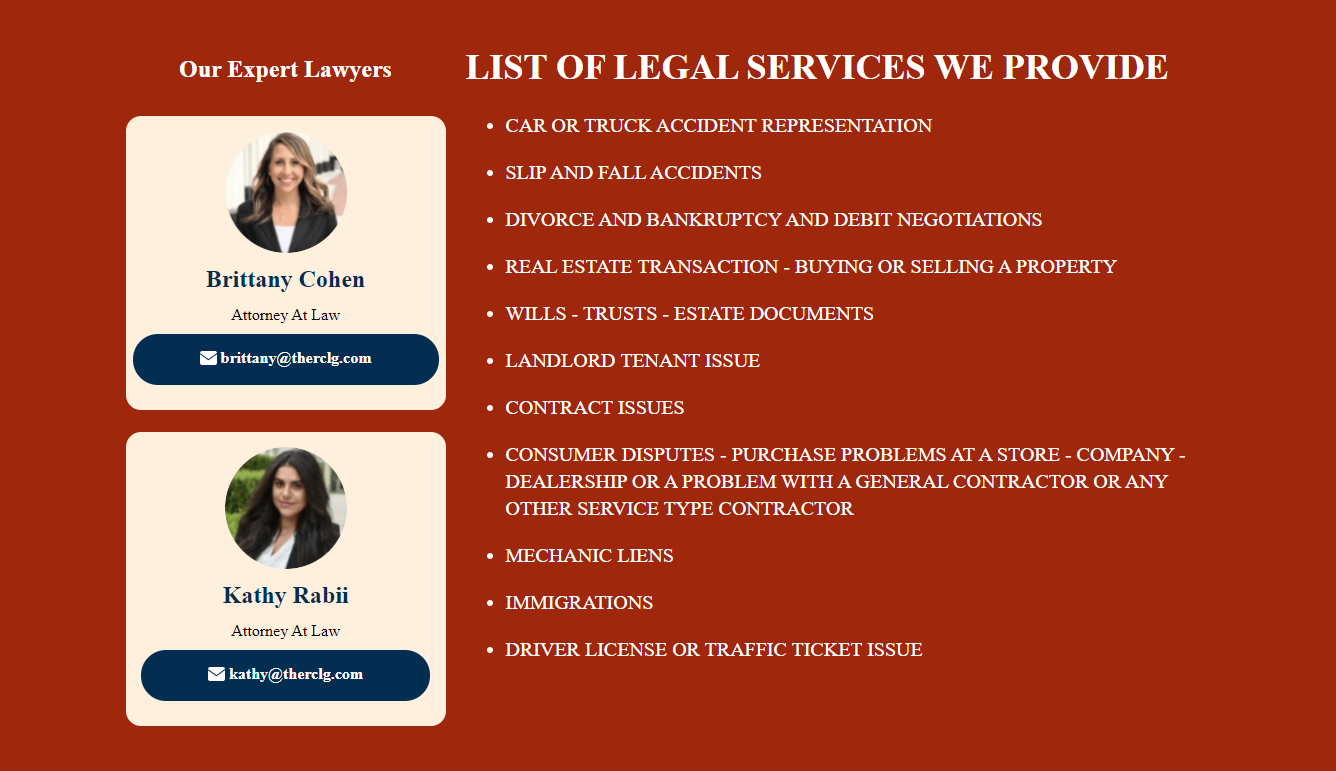
<h5>Our Expert Lawyers</h5>
<div class="a0036-box">
<img src="https://rclgarag.com/wp-content/uploads/2021/06/Ellipse-1.png">
<h4>Brittany Cohen</h4>
<h6>Attorney At Law</h6>
<a href="mailto:[email protected]">
<div class="a0036-btn">
<img class="a0036-icon" src="https://rclgarag.com/wp-content/themes/ua0/images/Subtract.svg">[email protected] </div>
</a>
</div>
<div class="a0036-box">
<img src="https://rclgarag.com/wp-content/uploads/2021/06/Ellipse-1-1.png">
<h4>Kathy Rabii</h4>
<h6>Attorney At Law</h6>
<a href="mailto:[email protected]">
<div class="a0036-btn">
<img class="a0036-icon" src="https://rclgarag.com/wp-content/themes/ua0/images/Subtract.svg">[email protected] </div>
</a>
</div>
</div>
<div class="column-text">
<h2>LIST OF LEGAL SERVICES WE PROVIDE</h2>
<ul>
<li>CAR OR TRUCK ACCIDENT REPRESENTATION</li>
<li>SLIP AND FALL ACCIDENTS</li>
<li>DIVORCE AND BANKRUPTCY AND DEBIT NEGOTIATIONS</li>
<li>REAL ESTATE TRANSACTION - BUYING OR SELLING A PROPERTY</li>
<li>WILLS - TRUSTS - ESTATE DOCUMENTS</li>
<li>LANDLORD TENANT ISSUE</li>
<li>CONTRACT ISSUES</li>
<li>CONSUMER DISPUTES - PURCHASE PROBLEMS AT A STORE - COMPANY - DEALERSHIP OR A PROBLEM WITH A GENERAL CONTRACTOR OR ANY OTHER SERVICE TYPE CONTRACTOR</li>
<li>MECHANIC LIENS </li>
<li>IMMIGRATIONS</li>
<li>DRIVER LICENSE OR TRAFFIC TICKET ISSUE</li>
</ul>
</div>
</div>
</div>
</div>
</div>
</section>
<!-- A0036 END -------------------------------->CSS
/* A0036 -----------------------------------------------------------*/
#a0036{
    background: #9F280C;
    padding: 50px 0px;
}

#a0036 h5{
    font-family: Open Sans;
    font-style: normal;
    font-weight: 600;
    font-size: 24px;
    line-height: 33px;
    text-align: center;
    color: #FFFFFF;
    margin-bottom: 30px;
    padding-bottom: 0px;
    margin-top: 10px;
}

#a0036 h2{
    font-family: Open Sans;
    font-style: normal;
    font-weight: 600;
    font-size: 36px;
    line-height: 49px;
    text-align: left;
    color: #FFFFFF;
    margin-bottom: 20px;
}

.a0036-box{
    background: #FFEFDD;
    border-radius: 15px;
    max-width: 320px;
    display: block;
    margin: auto;
    margin-top: 18px;
    margin-bottom: 22px;
    padding-top: 15px;
    padding-bottom: 25px;
}

.a0036-grid{
    display: grid;
    grid-template-columns: 320px 1fr;
    width: fit-content;
    grid-gap: 20px;
    margin: auto;
    grid-auto-flow: dense;
}

.column-photos{
    grid-column: 1;
}

.column-text{
    grid-column: 2;
}

#a0036 ul{
    margin: 0 0 0em 0em;
}

#a0036 li{
    font-family: Open Sans;
    font-style: normal;
    font-weight: normal;
    font-size: 20px;
    line-height: 27px;
    color: #FFFFFF;
    margin-bottom: 20px;
}

.a0036-box img{
    margin: auto;
    display: block;
    padding-bottom: 10px;
}

.a0036-box h4{
    font-family: Open Sans;
    font-style: normal;
    font-weight: 600;
    font-size: 24px;
    line-height: 33px;
    text-align: center;
    color: #032E52;
}

.a0036-box h6{
    font-family: Open Sans;
    font-style: normal;
    font-weight: normal;
    font-size: 16px;
    line-height: 22px;
    text-align: center;
    color: #000000;
}

.a0036-btn{
    background: #032E52;
    border-radius: 45px;
    width: fit-content;
    margin: auto;
    padding: 10px 67px;
    font-family: Open Sans;
    font-style: normal;
    font-weight: 600;
    font-size: 16px;
    line-height: 22px;
    color: #FFFFFF;
}

.a0036-icon{
    display: unset !important;
    margin-top: 7px !important;
    margin-right: 4px !important;
}


@media (max-width: 992px) {
    .a0036-grid{
        display: grid;
        grid-template-columns: 1fr;
        width: fit-content;
        grid-gap: 0px;
        margin: auto;
        grid-auto-flow: dense;
    }

    #a0036 h2 {
        text-align: center;
    }

    .column-photos{
        grid-column: 1;
        grid-row: 2;
    }

    .column-text{
        grid-column: 1;
        grid-row: 1;
    }
}
/* A0036 END -------------------------------------------------------*/
need to change svg image email to your