Two Image
A0025
Demo

Code With ACF Integration
HTML
<!-- a0025 --------------------------------------->
<?php if ( have_rows( 'a0025' ) ) : ?>
<?php while ( have_rows( 'a0025' ) ) : the_row();?>
<section id="a0025">
<div class="container">
    <div class="row">
        <div class="col-12">
            <h2><?=get_sub_field('header_1') ?></h2>
        </div>
        <div class="col-12 col-md-6 mt-4">
            <div class="a0025-block">
                <img src="<?=get_sub_field('image_1') ?>">
                <div class="a0025-label">
                    <h3><?=get_sub_field('label_1') ?></h3>
                </div>
            </div>
        </div>
        <div class="col-12 col-md-6 mt-4">
            <div class="a0025-block">
                <img src="<?=get_sub_field('image_2') ?>">
                <div class="a0025-label">
                    <h3><?=get_sub_field('label_2') ?></h3>
                </div>
            </div>
        </div>
        <div class="col-12">
            <h2><?=get_sub_field('header_2') ?></h2>
            <p>
                <?=get_sub_field('text') ?>
            </p>
        </div>
        <div class="col-12">
            <a href="<?=get_sub_field('link') ?>" ><span class="a0025-link"><?=get_sub_field('link_title') ?></span></a>
        </div>
    </div>
</div>
</section>
    <?php endwhile; ?>
<?php endif; ?>
<!-- a0025 End ----------------------------------->
CSS
/*-- a0025 --------------------------------------*/
#a0025{
    background: #f5f5f5;
    border-bottom: 1px solid #000;
}

#a0025 h2{
    text-align: center;
    margin-top: 25px;
    font-size: 50px;
    font-family: 'Playfair Display';
}

.a0025-block{
    border: 4px solid #EDB666;
    border-radius: 5px;
    position: relative;
}

.a0025-label{
    position: absolute;
    bottom: 0;
    height: 80px;
    background: rgb(0 0 0 / 66%);
    width: 100%;
    justify-items: center;
    align-items: center;
    display: grid;
}

.a0025-label h3{
    font-family: 'Oswald';
    color: #fff;
    font-size: 45px;
}

#a0025 p{
    text-align: center;
    width: 96%;
    font-size: 21px;
    display: block;
    margin: auto;
    margin-bottom: 20px;
    margin-top: 25px;
}

.a0025-link{
    text-align: center;
    color: #d3ad5a;
    display: block;
    margin: auto;
    font-size: 35px;
    font-family: 'Oswald';
    margin-bottom: 20px;
    font-weight: 400;
}

a:hover {
    color: #1d68a7;
    text-decoration: none;
}

@media (max-width: 576px) {
    #a0025 h2 {
        font-size: 40px;
    }

    .a0025-label h3 {
        font-size: 36px;
    }

    #a0025 p {
        font-size: 18px;
    }
}
/* a0025 END ------------------------------------*/
Code Only (Without ACF Integration)
HTML
<!-- a0025 --------------------------------------->
<section id="a0025">
<div class="container">
<div class="row">
<div class="col-12">
<h2>Our Areas of Expertise</h2>
</div>
<div class="col-12 col-md-6 mt-4">
<div class="a0025-block">
<img src="img1" style="width: 100%">
<div class="a0025-label">
<h3>Training</h3>
</div>
</div>
</div>
<div class="col-12 col-md-6 mt-4">
<div class="a0025-block">
<img src="img2" style="width: 100%">
<div class="a0025-label">
<h3>Consulting</h3>
</div>
</div>
</div>
<div class="col-12">
<h2>343 Overview</h2>
<p>
We are a dynamic and robust team of hazardous materials and emergency response instructors with the vision of continuing to simplify and demystify responses to chemical, biological, radiological and nuclear (CBRN) incidents.1 </p>
</div>
<div class="col-12">
<a href="#"><span class="a0025-link">About Us >></span></a>
</div>
</div>
</div>
</section>
<!-- a0025 End ----------------------------------->CSS
/*-- a0025 --------------------------------------*/
#a0025{
    background: #f5f5f5;
    border-bottom: 1px solid #000;
}

#a0025 h2{
    text-align: center;
    margin-top: 25px;
    font-size: 50px;
    font-family: 'Playfair Display';
}

.a0025-block{
    border: 4px solid #EDB666;
    border-radius: 5px;
    position: relative;
}

.a0025-label{
    position: absolute;
    bottom: 0;
    height: 80px;
    background: rgb(0 0 0 / 66%);
    width: 100%;
    justify-items: center;
    align-items: center;
    display: grid;
}

.a0025-label h3{
    font-family: 'Oswald';
    color: #fff;
    font-size: 45px;
}

#a0025 p{
    text-align: center;
    width: 96%;
    font-size: 21px;
    display: block;
    margin: auto;
    margin-bottom: 20px;
    margin-top: 25px;
}

.a0025-link{
    text-align: center;
    color: #d3ad5a;
    display: block;
    margin: auto;
    font-size: 35px;
    font-family: 'Oswald';
    margin-bottom: 20px;
    font-weight: 400;
}

a:hover {
    color: #1d68a7;
    text-decoration: none;
}

@media (max-width: 576px) {
    #a0025 h2 {
        font-size: 40px;
    }

    .a0025-label h3 {
        font-size: 36px;
    }

    #a0025 p {
        font-size: 18px;
    }
}
/* a0025 END ------------------------------------*/
image size 532X266
A0033
Code With ACF Integration
HTML
<!-- A0033 ------------------------------------------------>
<?php if (have_rows('a0033')) : ?>
    <?php while (have_rows('a0033')) : the_row(); ?>
        <section id="a0033">
            <div class="a0033-box" id="our-services" name="our-services">
                <h2><?php echo get_sub_field('header_1'); ?></h2>
                <h3><?php echo get_sub_field('subheader_1'); ?></h3>
                <ul>
                    <?php while (have_rows('items')) : the_row(); ?>
                        <li>
                            <span class="a0033-box-header-li"><?php echo get_sub_field('header'); ?></span>
                            <div><?php echo get_sub_field('subheader'); ?></div>
                        </li>
                    <?php endwhile; ?>
                </ul>
                <h2><?php echo get_sub_field('header_2'); ?></h2>
                <h3><?php echo get_sub_field('subheader_2'); ?></h3>
            </div>
            <div class="a0033-grid">
                <div class="a0033-item">
                    <img class="a0033-left-img" src="<?php echo get_sub_field('left-image'); ?>">
                </div>
                <div class="a0033-item">
                    <img class="a0033-right-img" src="<?php echo get_sub_field('right-image'); ?>">
                </div>
            </div>
        </section>
    <?php endwhile; ?>
<?php endif; ?>
<!-- A0033 END ------------------------------------------------>
CSS
/* a0033 css    ------------------------------------------------------- */
#a0033 {
    position: relative;
    border-bottom: 15px solid #BCBEC0;
}

.a0033-grid {
    display: grid;
    grid-template-columns: 1fr 1fr;
    align-items: center;
    justify-items: normal;
    width: 100%;
    margin: auto;
}

.a0033-left-img {
    width: auto;
    float: left;
    max-width: 450px;
}

.a0033-right-img {
    width: auto;
    float: right;
    max-width: 450px;
}

.a0033-box h2 {
    font-size: 30px;
    font-family: 'Montserrat' !important;
    color: #19BED5;
    text-align: center;
    font-weight: 700;
    margin-bottom: 3px;
    line-height: 35px;
}

.a0033-box h3 {
    font-size: 21px;
    font-family: 'Montserrat' !important;
    color: #F1748A;
    font-weight: 700;
    text-align: center;
}

.a0033-box {
    position: absolute;
    top: 50%;
    left: 50%;
    transform: translate(-50%, -50%);
    background: #ffffff6b;
    opacity: 1;
    height: auto;
    padding: 20px;
}

.a0033-box li {
    font-family: 'Montserrat' !important;
    text-align: left;
    line-height: 20px;
    margin-bottom: 6px;
}

.a0033-box ul, ol {
    display: block;
    margin: auto;
    max-width: 530px;
    margin-top: 15px;
    margin-bottom: 20px;
}

.a0033-box ul {
    list-style: none; /* Remove default bullets */
}

.a0033-box ul li::before {
    content: "\25A0";
    color: #19BED5;
    font-weight: bold;
    display: inline-block;
    width: 1em;
    margin-left: -1em;
}

.a0033-box-header-li {
    font-size: 20px;
    color: #5c5b5b;
    font-weight: 700;
}

@media (max-width: 992px) {
    .a0033-box {
        position: relative;
        top: 0;
        left: 0;
        transform: none;
        height: auto;
        padding: 20px;
    }

    .a0033-right-img {
        width: 100%;
        padding: 20px;
    }

    .a0033-left-img {
        width: 100%;
        padding: 20px;
    }
}

@media (max-width: 768px) {
    .a0033-grid {
        grid-template-columns: 1fr;
    }

    .a0033-right-img {
        float: none;
        margin: auto;
        display: block;
    }

    .a0033-left-img {
        float: none;
        margin: auto;
        display: block;
    }

    .a0033-box {
        padding: 20px 20px 0px 20px;
    }

}

/* a0033 css end ------------------------------------------------------- */
Code Only (Without ACF Integration)
HTML
<!-- A0033 ------------------------------------------------>
<section id="a0033">
<div class="a0033-box" id="our-services" name="our-services">
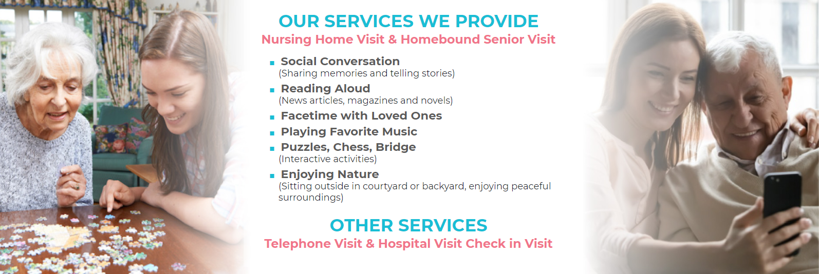
<h2>OUR SERVICES WE PROVIDE</h2>
<h3>Nursing Home Visit & Homebound Senior Visit</h3>
<ul>
<li>
<span class="a0033-box-header-li">Social Conversation</span>
<div>(Sharing memories and telling stories)</div>
</li>
<li>
<span class="a0033-box-header-li">Reading Aloud </span>
<div>(News articles, magazines and novels)</div>
</li>
<li>
<span class="a0033-box-header-li">Facetime with Loved Ones</span>
<div></div>
</li>
<li>
<span class="a0033-box-header-li">Playing Favorite Music</span>
<div></div>
</li>
<li>
<span class="a0033-box-header-li">Puzzles, Chess, Bridge </span>
<div>(Interactive activities)</div>
</li>
<li>
<span class="a0033-box-header-li">Enjoying Nature </span>
<div>(Sitting outside in courtyard or backyard, enjoying peaceful surroundings)</div>
</li>
</ul>
<h2>OTHER SERVICES</h2>
<h3>Telephone Visit & Hospital Visit Check in Visit</h3>
</div>
<div class="a0033-grid">
<div class="a0033-item">
<img class="a0033-left-img" src="https://wewillvisit.com/wp-content/uploads/2021/06/img_2.jpg">
</div>
<div class="a0033-item">
<img class="a0033-right-img" src="https://wewillvisit.com/wp-content/uploads/2021/06/img_3.jpg">
</div>
</div>
</section>
<!-- A0033 END ------------------------------------------------>CSS
/* a0033 css    ------------------------------------------------------- */
#a0033 {
    position: relative;
    border-bottom: 15px solid #BCBEC0;
}

.a0033-grid {
    display: grid;
    grid-template-columns: 1fr 1fr;
    align-items: center;
    justify-items: normal;
    width: 100%;
    margin: auto;
}

.a0033-left-img {
    width: auto;
    float: left;
    max-width: 450px;
}

.a0033-right-img {
    width: auto;
    float: right;
    max-width: 450px;
}

.a0033-box h2 {
    font-size: 30px;
    font-family: 'Montserrat' !important;
    color: #19BED5;
    text-align: center;
    font-weight: 700;
    margin-bottom: 3px;
    line-height: 35px;
}

.a0033-box h3 {
    font-size: 21px;
    font-family: 'Montserrat' !important;
    color: #F1748A;
    font-weight: 700;
    text-align: center;
}

.a0033-box {
    position: absolute;
    top: 50%;
    left: 50%;
    transform: translate(-50%, -50%);
    background: #ffffff6b;
    opacity: 1;
    height: auto;
    padding: 20px;
}

.a0033-box li {
    font-family: 'Montserrat' !important;
    text-align: left;
    line-height: 20px;
    margin-bottom: 6px;
}

.a0033-box ul, ol {
    display: block;
    margin: auto;
    max-width: 530px;
    margin-top: 15px;
    margin-bottom: 20px;
}

.a0033-box ul {
    list-style: none; /* Remove default bullets */
}

.a0033-box ul li::before {
    content: "\25A0";
    color: #19BED5;
    font-weight: bold;
    display: inline-block;
    width: 1em;
    margin-left: -1em;
}

.a0033-box-header-li {
    font-size: 20px;
    color: #5c5b5b;
    font-weight: 700;
}

@media (max-width: 992px) {
    .a0033-box {
        position: relative;
        top: 0;
        left: 0;
        transform: none;
        height: auto;
        padding: 20px;
    }

    .a0033-right-img {
        width: 100%;
        padding: 20px;
    }

    .a0033-left-img {
        width: 100%;
        padding: 20px;
    }
}

@media (max-width: 768px) {
    .a0033-grid {
        grid-template-columns: 1fr;
    }

    .a0033-right-img {
        float: none;
        margin: auto;
        display: block;
    }

    .a0033-left-img {
        float: none;
        margin: auto;
        display: block;
    }

    .a0033-box {
        padding: 20px 20px 0px 20px;
    }

}

/* a0033 css end ------------------------------------------------------- */